 What kind of smart phone can Rs 44,500 buy? The luxe Xperia X1 from Sony Ericsson. At this price, it probably appeals only to recession-resistant gadget lovers, but it says something about what some gadget makers think the rest of us would want if money were no object.
Here's reviewing the new iPhone rival on the block.
Straight specs
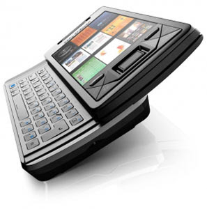
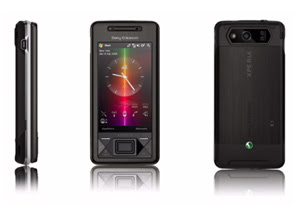
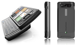
 Out of the box, the device is pure eye candy, with a black or silver metal-and-plastic body, crisp 3-inch touch screen and slightly curved QWERTY keyboard that slides out smoothly with a satisfying click. The X1 has minimal included memory, so you'll need a sizable microSD card if you want to access lots of songs, videos and photos on it; I used a 4 gigabyte card during my testing, which was enough for plenty of content.
But even before I turned it on, I started to get nervous about the whopping number of choices I'd have to make. I felt more confused about the phone's operations than excited about the freedom to use it as I pleased.
11 buttons and a joystick
 There is assortment of 11 buttons on the X1's face, including a center button that can select items or work as an optical joystick, which scrolls with a finger swipe. I often used the buttons for starting and ending phone calls, but tended to forget about the rest of the controls, including the joystick.
Beyond the button bounty, you can navigate the X1 by tapping its screen with your finger or with a stylus. The stylus was often the best way to go, as the device's many options are often presented in small text that is difficult to accurately jab at with an index finger.
Customised apps
 The X1 uses Windows Mobile 6.1 as its operating system, but Sony Ericsson developed a variety of customised enhancements that run on top of it. Most notable is the stylish panel interface, which consists of up to nine small rectangles you can customise and use to view different applications or media on the device in different ways.
The panel idea is cool, and it's a nice way to differentiate the X1 from the slew of touchscreen phones that have been released this year, since each rectangle leads to a variety of options, instead of just a single application. I used panels for conducting Google searches, listening to the built-in FM radio and checking out the songs and videos I stored on the X1.
However, the panel interface still sits atop Windows Mobile, which offers its own methods for listening to tunes or watching videos. I couldn't understand why anyone would want so many options.
Business mail
 That said, the inclusion of Windows Mobile does mean that if you're familiar with it you won't have much trouble navigating the X1 once you find and click the "Start" tab in the upper right corner of one of the panels.
Business users can synchronise the phone with their PCs and get e-mail from their Microsoft Outlook account pushed straight to the phone -- something that can make it difficult to switch to a more consumer-friendly phone like the iPhone or the G1, which uses Google Inc's Android operating system.
Better resolution than iPhone
 And there are several cool features on the X1. Though the iPhone has a larger screen, the X1's touch screen sports a sharper resolution. As such, videos look quite good. You can also stream some content from the Internet, such as videos from YouTube, and adjust video sizes to make lesser-quality clips look more palatable.
The X1 also has a standard headphone jack, which is becoming increasingly common on smart phones and makes a big difference to music fans like myself.
Surfing the Web is easy on the X1, and, as with videos, online content looks very good on the screen. The phone includes the Internet Explorer Mobile and Opera Mobile browsers, and I did appreciate having more than one option here.
The built-in 3.2 megapixel camera takes good photos and can also be used for videos. The phone also has a video calling option.
Applications slow
 Still, my issues with the X1 often overshadowed the fun. Many times it seemed fairly slow to open applications or complete actions, displaying the multicolored Windows processing icon while I waited.
Even without slowdown, it usually took me several steps to complete a simple action. When I wanted to change the panels on the device, I had to click a little tools icon, click the panel I wanted to change, click it again to confirm I really did want to alter it, choose a new panel, and click again to select it. After all this clicking, I could barely remember what I was trying to do in the first place.
The X1 is a gorgeous device. But even if you can afford it, dealing with its overabundance of choices would, in the words of Dewey Finn from "School of Rock," test your head and your mind and your brain, too.


0 comments:
Post a Comment